
|
|

|
ANALYSING MY INTERPRETATIONS OF
SARAH GRAHAMS WORK:
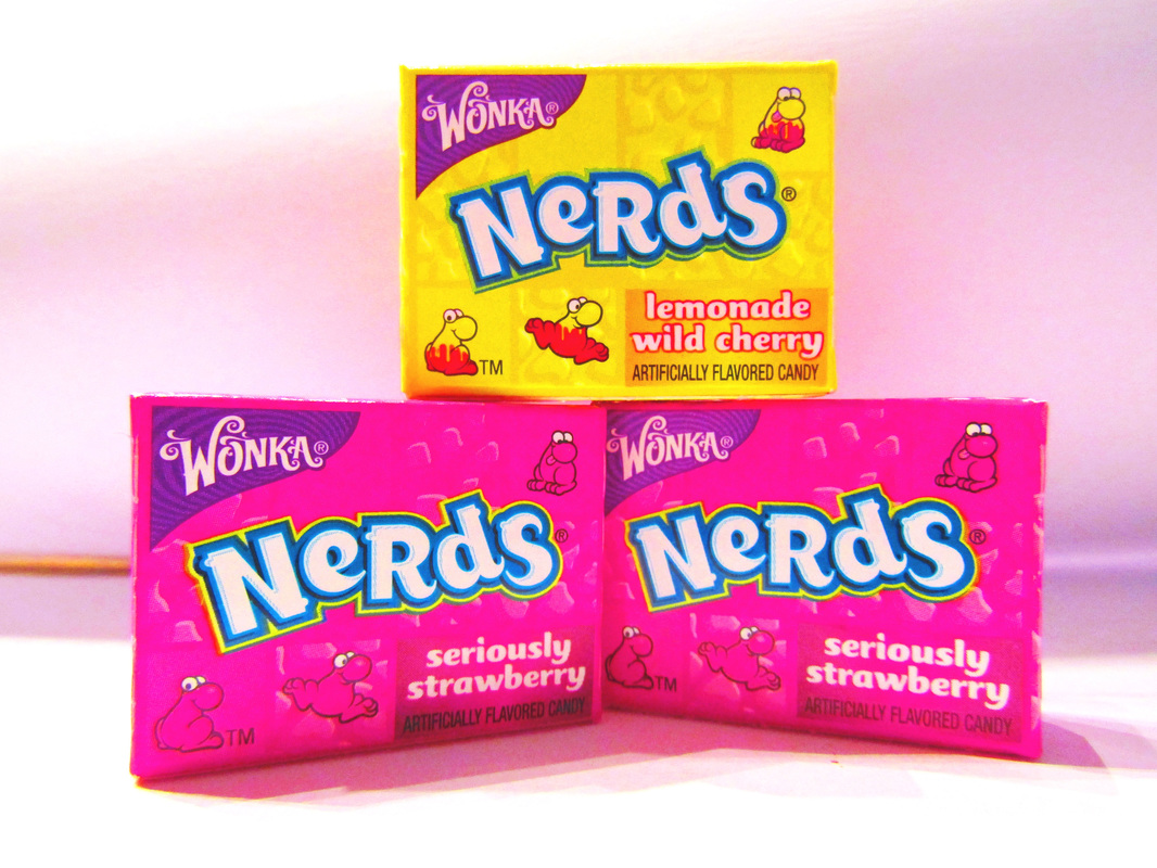
NERDS.
This image of Nerds boxes stacked on top of one another is filled with vivid colours which engages the audience as it is not dull. It is a very simple image but is still effective. The vibrant colours help the sweets emerge from the clean, crisp, quiet background. The main focus is on the sweets as there is nothing else in the image to disturb the attention of the viewer. 
CHUPA CHUPS CHAIR.
This image is similar to Sarah Grahams image of Chupa Chups in some respects because of the collection of lollipops in close proximity to each other. This follows Sarah Grahams usual style of expressive colours which enhance the image. The use of a chair as a prop is unlike Sarah Graham's usual style but I feel this adds to the image. It makes the photo much more interesting than if the lollipops were just put on a background without any other objects in the scene. |
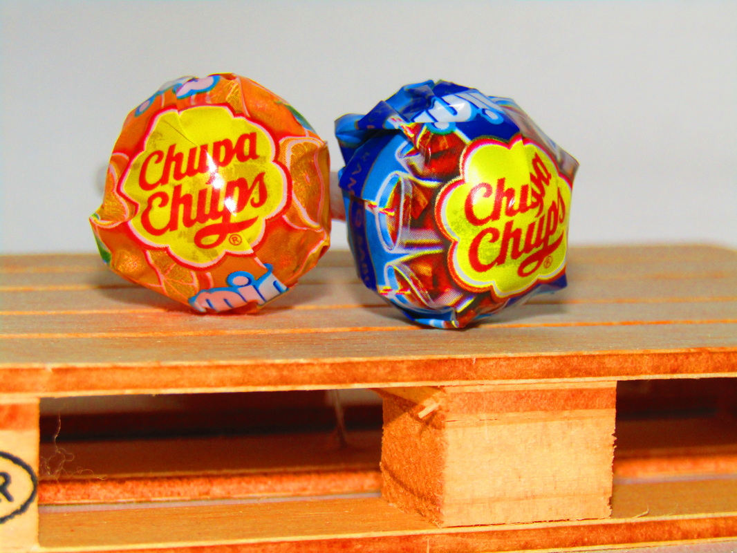
CHUPA CHUBS PALETTE.
The Chupa Chups lollipops look great on the wooden pallet because it makes the image more compelling. Due to the clean, simple background and their luminous glow, the lollipops leap out of the image at the viewer. The main focus is on the lollipops. I know this because the logo and branding is clear to read. The vibrance of the orange Chupa Chubs lollipop complements the colour of the palette it has been place upon. It can be seen that the photograph was staged because the lollipops were on a wooden palette which is not a natural place for them to be. 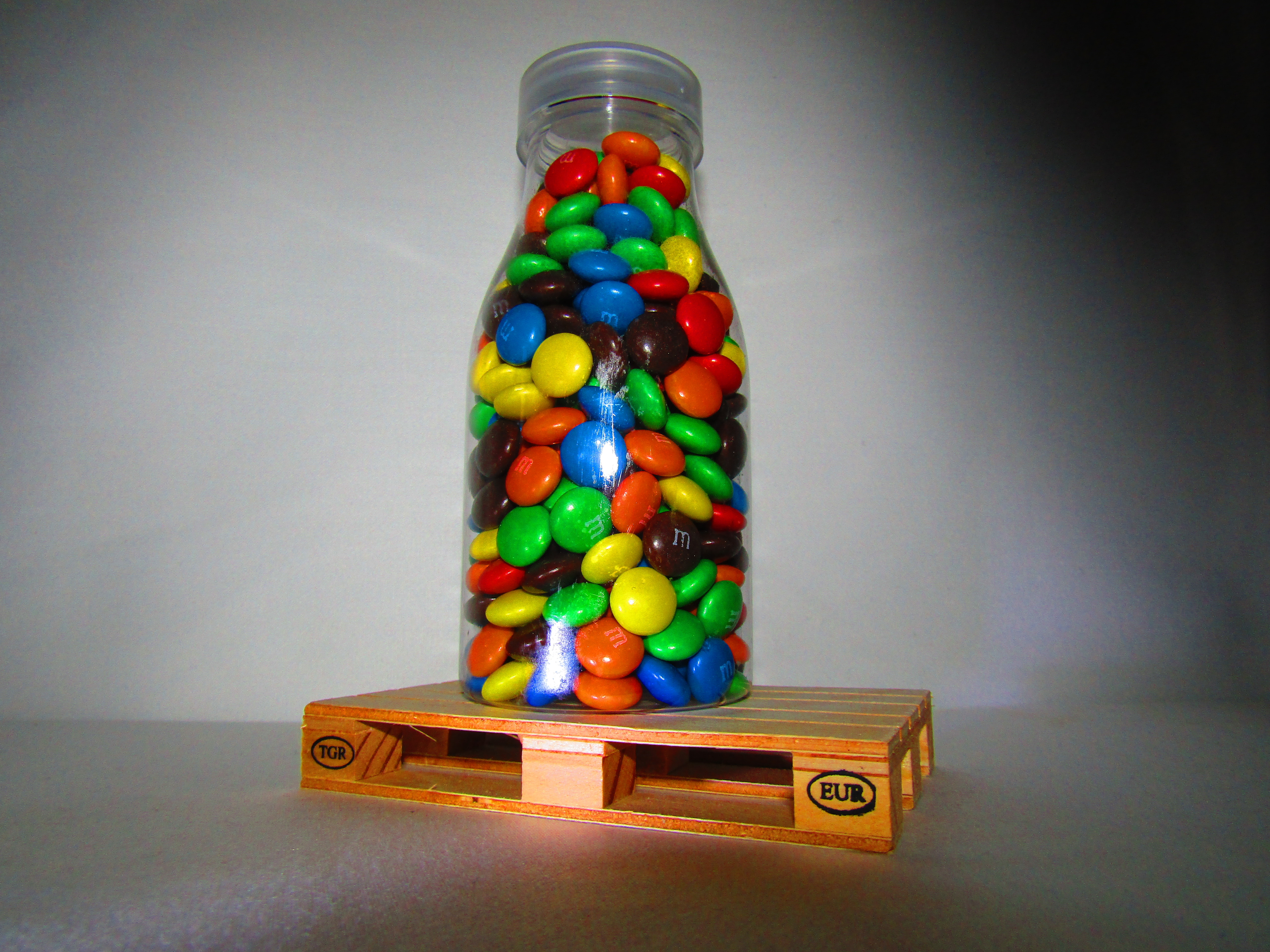
SWEETS.
This image, taken in the style of Sarah Graham, is filled with the vibrant colours of M and M sweets in a plastic bottle on top of a wooden palette. The vivid colours used in the photo follow Sarah Graham's very eccentric style, making a very engaging image. - has been used on the edges of the image to add mystery and help the image blend together. This was the only edit put on this photo. Also the photo was taken at a low angle in order to make the bottle of sweets seem larger than it actually is. |
