

|
Dennis Pedersen is a still life photographer who owns his own business and works with some well - known companies. For example, he works with Adidas, Marks & Spencer, Boots, Oral B, Estée Lauder, Puma, Rimmel, L'Oréal, Toni & Guy and many more... Dennis Pederesn specialises in make up and cosmetics but also photographs other objects. Pedersen turns ordinary items into spectacular, dynamic imagery - its an art that he as perfected for over 20 years. Pedersen’s studio is highly sought after by clients from many sectors. They all seek a highly creative response to the photography of their products. Pedersen employs techniques and effects that bring materials and brands to life which can be seen throught his photos. As Dennis Pedersen works with a wide variety of clientele, his pictures are varied and therefore, he does not follow a one, specific theme. Dennis Pedersen's pictures all have an effect which makes them look similar. |
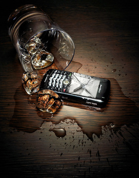
WHISKEY GLASS.
This is a colour photograph by Dennis Pedersen, who is a British photographer. It shows a tipped over whiskey glass with ice behind a small phone with a cracked screen. The use of artificial light meant the brightness and intensity of the light could be controlled. A dark, vintage effect, which has been used, adds a sense of mystery to the image. The light source has been aimed at the centre of the image, causing the darkened background to blend into the centre of the image where the main objects are in focus. With very little colour in this photo, it is very engaging to its viewer. The low amount of light captivates the viewer's attention. I was first drawn to this image because of the subtle use of colour in the photograph.
|

JUNGLE WATCHES.
In this photo by Dennis Pedersen, the colour of the twigs compliment the watches because they are all similar brown and gold colours. The watches seem to be placed randomly, but this picture was staged because you don't usually find watches on piles of twigs. However, it looks natural due to the background of twigs. I think that natural light was used in this photo. The thing that first attracted me to the photo was the natural colours - browns and golds. I really like this photo because it links modern watches and technology with nature. The objects blend together well due to the use of similar colours. This picture was taken from above but has a slight tilt.
|
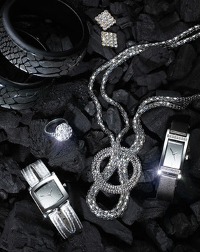
SILVER JEWELLERY.
This photograph, by Dennis Pedersen, shows six pieces of jewellery on some black charcoal. It only has 2 main colours which stops the image from looking too complicated and causing the viewer to lose interest in the image. Only silver and black objects have been used in this colour photograph making it seem modern. Although the image does not stand out with vibrant colours and highlights, it looks very stylish with the modern colours which engage the audience. I was first attracted to this photo because of the few colours which make the photo so interesting and engaging. This image has a muted colour palette. I know this because the colours arent bright, they are quiet and subdued.
|

|
GRID IMAGE.
This simple photoshop edit by Dennis Pedersen may be easy to do but is still very effective. It shows four different pictures, of totally different objects, taken with a white background and then cropped in half and joined together. This engages the viewer because the four objects are completely different to one another but blend well together which can be seen in the image because of how they have been cropped together. The white background and plenty of light presents a positive atmosphere. This also makes the image look aesthetically pleasing. |
|
STELLA ARTOIS.
In this colour photograph by Dennis Pedersen, the viewer's attention is drawn to the centre of the image due to the darkened background and highlighted beer glass. The beer glass stands out because the artificial light source was aimed at it and the edges of the image are blackened and fade smoothly into the centre, towards the beer glass. This photoshop edit is called a viginette filter and is when the edges are darkened so the photo blends together well. This picture was taken using artificial light. I know this because of the unnatural background and the lack of light in the photo. Using the darkness to enhance the image, Pedersen intended to make the beer glass glow and stand out from the table and background. The main focus in the image is on the Stella Artois beer glass which makes me think that the photo is advertorial, a company paid Pedersen to take it. |

|

|
FRAGRANCE TREE.
This simple, low-light photograph by Dennis Pedersen is one that inspired me to do my own. This photo first attracted me because of the fragrances being linked to naure and blending very well. The objects in the image have obviously been staged. The fragrance bottles have been placed onto some vintage, wooden floorboards. The photographer has tried to make the photo look natural and I know this because he has placed leaves between the bottles in the foreground and the wooden floorboards in the background. Personally, I like this image because the photographer has tried to link two contrasting objects together. Similar to some of Dennis Pedersen's other work, this photo has a sligh viginette filter applied which further helps the whole image blend together well. |
|
Companies he has worked with:
|
|
DENNIS PEDERSEN'S WEBSITE: www.dennispedersen.com
